- Home
- Creating a Distinct Visual Brand Identity System
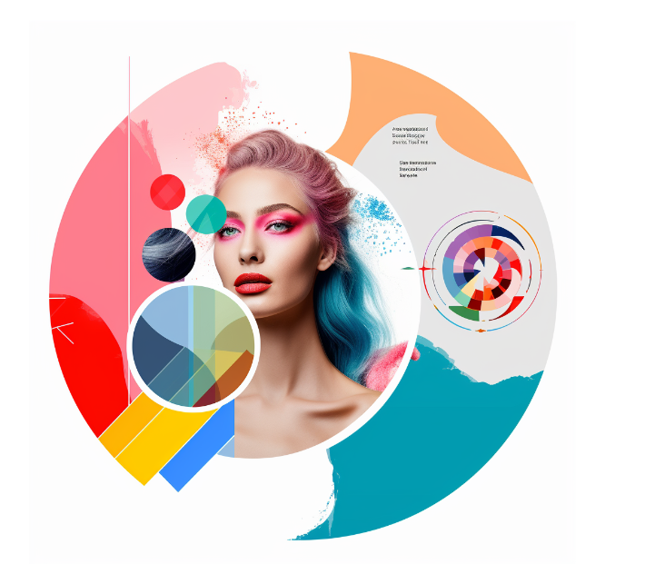
Creating a Distinct Visual Brand Identity System
Building a strong brand identity is crucial for companies today. With so much competition and noise, you need visuals that make your brand memorable and distinctive. But where do you start crafting a system that achieves this?
In this in-depth guide, I’ll walk you through the key elements of visual identity systems. I’ll share tips on conducting research, defining your brand personality, and choosing design components. You’ll learn how to create versatile branding that allows room to evolve.
I’ll also cover building brand guidelines, assets and implementing your system cohesively across touchpoints. My goal is to provide a practical roadmap to develop visual branding that makes your company stand out. Let’s get started!
Why Visual Identity Matters
Before we dive into the how-to, it’s important to understand why visual identity deserves focus. A strong system does more than just look pretty:
- It communicates your core values and personality. The colors, fonts, imagery you choose tell a story about your brand.
- It builds consistency across diverse touchpoints – website, packaging, ads, etc. This boosts recognition.
- It allows flexibility to adapt as your business grows. While some elements stay fixed, others can be updated.
- It simplifies marketing by equipping teams with on-brand assets and guidance readily available.
In short, your visual identity is a strategic tool, not just decorative. When carefully crafted, it becomes an invaluable asset reinforcing your brand in people’s minds.
Understanding Brand Identity Systems
A visual brand identity system refers to the set of design elements, guidelines and assets that comprise the visual face of a brand. This includes the logo, color palette, typography, iconography, imagery style, and standardized graphics like patterns and textures.
Together, these components create an immediately recognizable look and feel that identifies a brand and distinguishes it from competitors. When developed thoughtfully, a brand identity system injects visual interest and personality into a company’s communications, environments and products across all media and platforms.
But a successful brand identity system does more than just create visual appeal. It also:
– Communicates your brand values and personality – The colors, fonts, tone of voice all tell a story about who you are as a brand. An effective system aligns aesthetics with brand positioning.
– Provides continuity across touchpoints – From your website to business cards, branded environments to marketing emails, a consistent identity system unifies diverse platforms.
– Allows for flexibility and evolution – While some elements remain fixed, like logo and core colors, others can be adapted as a brand grows and targets new audiences.
– Simplifies marketing efforts – With brand guidelines and assets ready to go, it’s easier for everyone in the organization to reinforce branding.
So in summary, your brand identity system is much more than just a pretty logo. It’s a strategic tool for differentiation and connection. When done right, it becomes an invaluable asset.
Key Elements of a Visual Brand Identity System
When designing a visual identity system, there are several core components across which you’ll want to establish and maintain consistency:
Logo
As the primary visual representation of your brand, your logo is likely the first element you’ll think of when creating your identity system. It will appear across all brand touchpoints and marketing materials.
Your logo should be:
– Memorable – A great logo is distinctive, evoking emotion and memorability through smart use of shape, symbols and style.
– Versatile – It needs to work across a range of contexts, from letterheads to app icons, in both color and black and white.
– Timeless – Choose a style that will stand the test of time rather than chase fleeting trends.
– Strategic – It should reinforce your positioning and connect to your brand values and personality.
Color Palette
Color is one of the most immediate ways to identify a brand. Pick 2-4 core brand colors to establish visual continuity:
– Primary color – This is the color most commonly associated with your brand, used prominently in logo and branding.
– Secondary colors – These supporting colors provide visual interest and variety while still feeling connected.
– Accent colors – Sparingly used accent colors can draw attention to key elements.
Ensure colors coordinate with your logo and reinforce brand personality.
Typography
Typography is central to all brand communications from websites to brochures. Choose 1-2 fonts to use consistently:
– Primary font – Used for headlines and branding. Should align to brand personality.
– Secondary font – A complementary text font for paragraph copy. Should be easy to read.
Tip: Limit font variations to maintain cohesion across brand applications.
Iconography
Icons, symbols and pictograms can act as visual shortcuts for key brand elements or conveying information quickly. Develop a set of icons for recurrent Actions like search, shopping cart etc. to use across touchpoints. Align stylistically to your brand illustration style.
Photography Style
Photography can powerfully convey brand stories and emotions. Assess:
– Subject matter – People, products, textures, environments?
– Composition – Portraits, still life, documentary styling?
– Lighting/color – Bright, muted, high contrast?
– Styling – Casual, polished, minimal?
– Models – Lifestyle, diversity, brand archetypes?
Aim for a consistent style and tone.
Illustration Style
Like photography, illustrations and graphics should also feel cohesive:
– Medium – Vector, painterly, collage, 3D?
– Color palette – Should align with brand colors.
– Styling – Minimalist, retro, abstract, character-driven?
Illustrations allow room for creativity while strengthening brand recognition.
Tone and Voice
The style in which you communicate is another opportunity to reinforce brand identity. Is your copy:
– Formal – Authoritative, traditional, corporate?
– Casual – Conversational, fun, irreverent?
– Emotional – Inspirational, empathetic, feel-good?
– Humorous – Witty, fun, amusing?
– Intellectual – Technical, expertise-led, serious?
Align tone with brand positioning and audience expectations.
Graphic Elements and Patterns
Recurring graphic motifs like backgrounds, frames, dividers and textures are a great way to inject personality and visual interest while further unifying your identity system. These can include:
– Backgrounds – Subtle textures or geometric shapes
– Frames and dividers – Banners, lines, graphic shapes to structure layouts
– Graphic accents – Icons, animations, illustrated elements
– Repetition – Repeating motifs like dots, shapes or lines
Keep these flexible elements on-brand in terms of color, shape and style.
By establishing guidelines for each of these elements, you create a set of visual building blocks that can be adapted across diverse contexts while retaining brand consistency. Next let’s look at how to develop this into a cohesive yet versatile system.
Developing a Cohesive Yet Flexible System
When designing your visual identity system, you’ll need to find the right balance between consistency and flexibility. Branding that’s too fixed quickly feels stale and dated. But without sufficient continuity, recognition and recall suffers.
Here are some strategies to build in versatility:
Start with fixed core elements – Anchor your system around fixed elements like logo, core brand colors and typography for continuity.
Then add adaptable elements – Such as flexible secondary colors, changeable graphics and photography styles.
Create style variants – For logo, consider condensed and simplified versions, black and white or single color options.
Provide clear guidelines – Specify ideal use cases and adaptations for logo, color, fonts etc.
Show examples in context – Showcase applications on stationery, ads, packaging and more.
Add a shared toolkit – Provide digital files for all visual assets and guidelines.
The goal is to find the right balance between constraints that ensure brand recognition while allowing for relevant, on-brand creativity that keeps the identity feeling fresh. Next, let’s talk research and strategy.
Conducting Brand Research and Competitive Analysis
Before you start designing, it’s important to understand your brand strategy, target audience and competitive landscape. Useful activities include:
– Brand strategy review – Revisit your core brand positioning and values. Know your differentiators inside out.
– Competitor audit – Objectively assess how competitors position their brand identities and how you can differentiate through your visual system.
– Consumer research – Get into the hearts and minds of your audience through interviews, surveys and focus groups. Understand their expectations and aspirations.
– Moodboard creation – Curate visual inspirations based on brand values, emotions and personality attributes you want to convey.
Immersing yourself in facts, insights and inspirations will inform smart design choices rooted in strategy, not just aesthetics.
Defining Your Brand Personality and Values
Your visual identity should express your brand’s personality – the human traits and values associated with your company. Start by defining your brand character using descriptors like:
Down-to-earth, playful, innovative, thoughtful, reliable, creative, sophisticated, inclusive…
Then identify values important to your brand like sustainability, authenticity, community, quality, transparency…
This brand personality will guide all your visual identity decisions – from color palette to imagery – to create a cohesive look and feel.
Choosing Versatile Design Elements
With research done, it’s time to get into the visual details! To build flexibility into your system, follow these tips when choosing design elements:
Pick classic over trendy – Choose shapes, fonts, styles with enduring appeal rather than temporary trends.
Use style versatility – Mixing elegance with a casual edge, or modern with retro creates breadth.
Simplify core elements – Like logos – to allow more embellishment elsewhere.
Carefully choose accent colors – Trendier secondary hues make it easier to refresh.
Build in stylistic flexibility – Having options for photography or illustration styles prevents predictability.
Add adaptability – Simple mono icons and logos, editable templates.
Provide guidelines for context – Show how elements can be adapted for different contexts.
The goal is to create touchpoints that feel current, on-brand, and connected through core visual markers, without the entire identity feeling rigid or trapped in one time period.
Creating Brand Guidelines and Assets
Now it’s time to pull together everything into a comprehensive brand guide that will ensure correct ongoing implementation of your new identity system. Essential components include:
Logo Guidelines
– Logo files in all formats (EPS, PNG)
– Clearspace and sizing requirements
– Color, black and white and reversed out versions
– Approved variations – snippets, icon-only
– Unacceptable logo usage examples
Typography Guidelines
– Primary and secondary font choices
– Approved applications – headings vs body copy
– Color specifications
– Sizing, kerning, formatting standards
– Examples of font usage
Color Guidelines
– Primary, secondary and accent color swatches
– CMYK/Pantone/RGB/Hex color values
– Usage guidance – percentages, combinations and when to use each
Imagery Guidelines
– Curated examples that align to brand style
– Dos and don’ts for subject matter, composition, styling
– Explanations for any mandatory elements
Graphic Elements
– Illustrations, patterns, icons, animations
– Downloadable digital asset files
– Instructions for usage and adaptation
Copy Guidelines
– Company voice, tone, writing style overview
– Brand terminology dictionary
– Grammar and formatting rules
Editable Templates
– Letterheads, presentations, ads, social posts
– Quickly roll out polished branded collateral
Distribute digitally to all internal teams to ease adoption. Update as the brand evolves.
Implementing Your Brand Identity System
The benefits of a strong brand identity system only emerge through correct use across customer and employee touchpoints. Consistency builds recognition and trust.
Here are some key applications to focus on:
Apparel and Merchandise
Make sure branded apparel like t-shirts, caps and uniforms feature the logo prominently and use approved colors. Consider smaller repeat prints of graphic motifs rather than large logos to retain sophistication.
Packaging
Packaging design presents excellent opportunities to reinforce visual identity through logo, color blocking, typography and graphics. Ensure even the smallest details align to brand style.
Advertising and Marketing Materials
From website to business cards, digital ads to brochures, every external communication should uniformly reflect the brand identity. Provide templates and assets to marketing teams.
Digital Presence
Beyond the main website, today’s brands need a consistent identity across blogs, social media, mobile apps and more. Create digital brand kits that are easy to implement.
Physical Spaces
In-store displays, events, trade show booths, and office interiors offer immersive opportunities to bring your brand to life through environmental graphics and industrial design.
Training customer-facing staff on brand guidelines, and appointing brand ambassadors internally will ease adoption. Track success through brand awareness surveys and metrics. This establishes your visual identity as an invaluable business asset.
Refreshing and Evolving Your Brand Identity System Over Time
Brand identity systems aren’t set in stone. As businesses grow and target new demographics, visual identities also need to evolve.
Aim to refresh, not completely redo your system every 3-5 years. Think of small tweaks rather than dramatic overhauls:
– Update photography and illustration styles
– Change secondary colors and graphics
– Modify tone of voice in messaging
– Increase font variations for more flexibility
– Expand branding applications into new media
– Simplify and refine logo details if needed
By respecting brand equity in your core visuals, and making purposeful but not excessive changes, you can keep your brand identity feeling relevant over decades.
Conclusion
A thoughtful, strategic brand identity system is invaluable for companies to stand out with consistent, recognizable branding across diverse touchpoints.
By codifying visual style guidelines around core elements like logo, color and typography, while allowing for flexibility in areas like imagery and graphics, you can develop an identity that is cohesive yet versatile.
Backed by brand research and strategy, designed to reflect brand personality, and implemented holistically across customer and employee experiences, a compelling visual identity system becomes an important driver of brand differentiation, consistency and connection.
Approached with care and creativity, your visual identity system can evolve with your brand over time, retaining equity while staying fresh. This investment in thoughtful branding yields immense value as a business asset, and should be an ongoing focus area with regular reviews and updates.
In today’s crowded marketplace, developing a distinctive visual identity is no longer optional, it’s an imperative. Use the strategies and guidelines in this guide to craft a unique brand vision that resonates emotionally with your audiences and makes your brand unforgettable.
Author Bio

Wimgo
Other post in Categeory
© 2022 Wimgo, Inc. | All rights reserved.